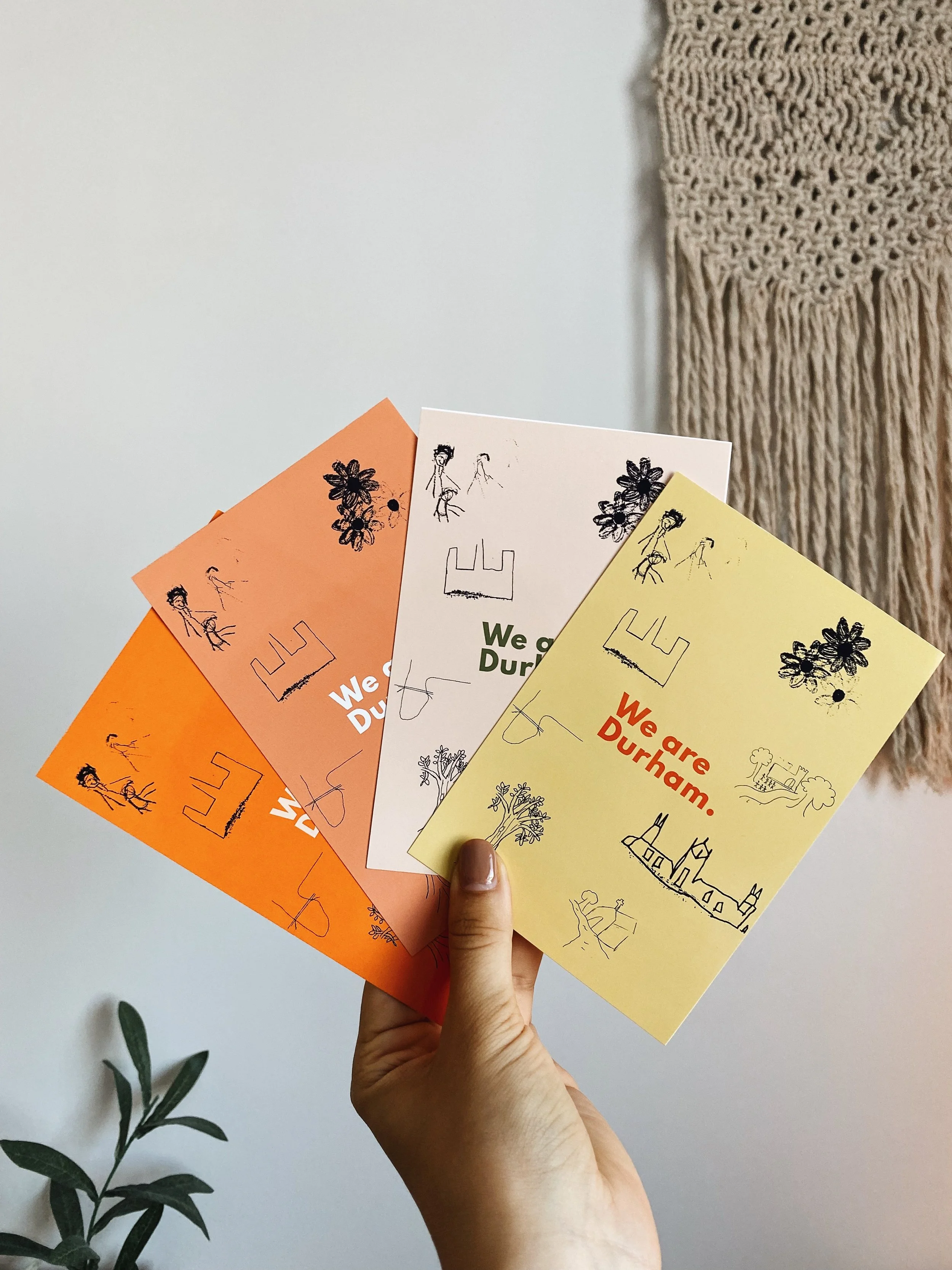
A community-built visual identity, turned into a printed postcard series using hand-drawn local contributions.
We Are Durham started with a question: what if a place’s visual identity wasn’t designed for people - but with them?
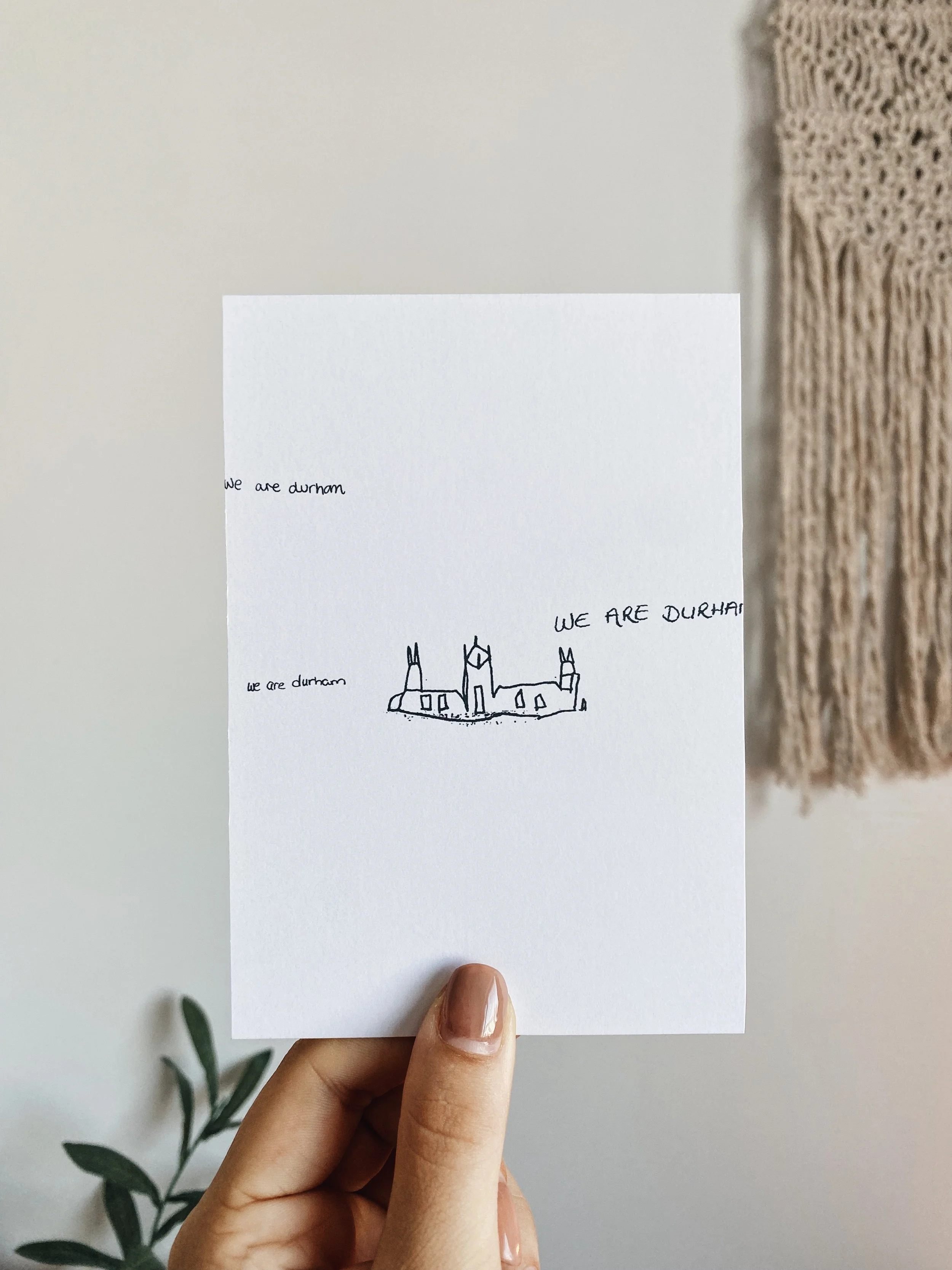
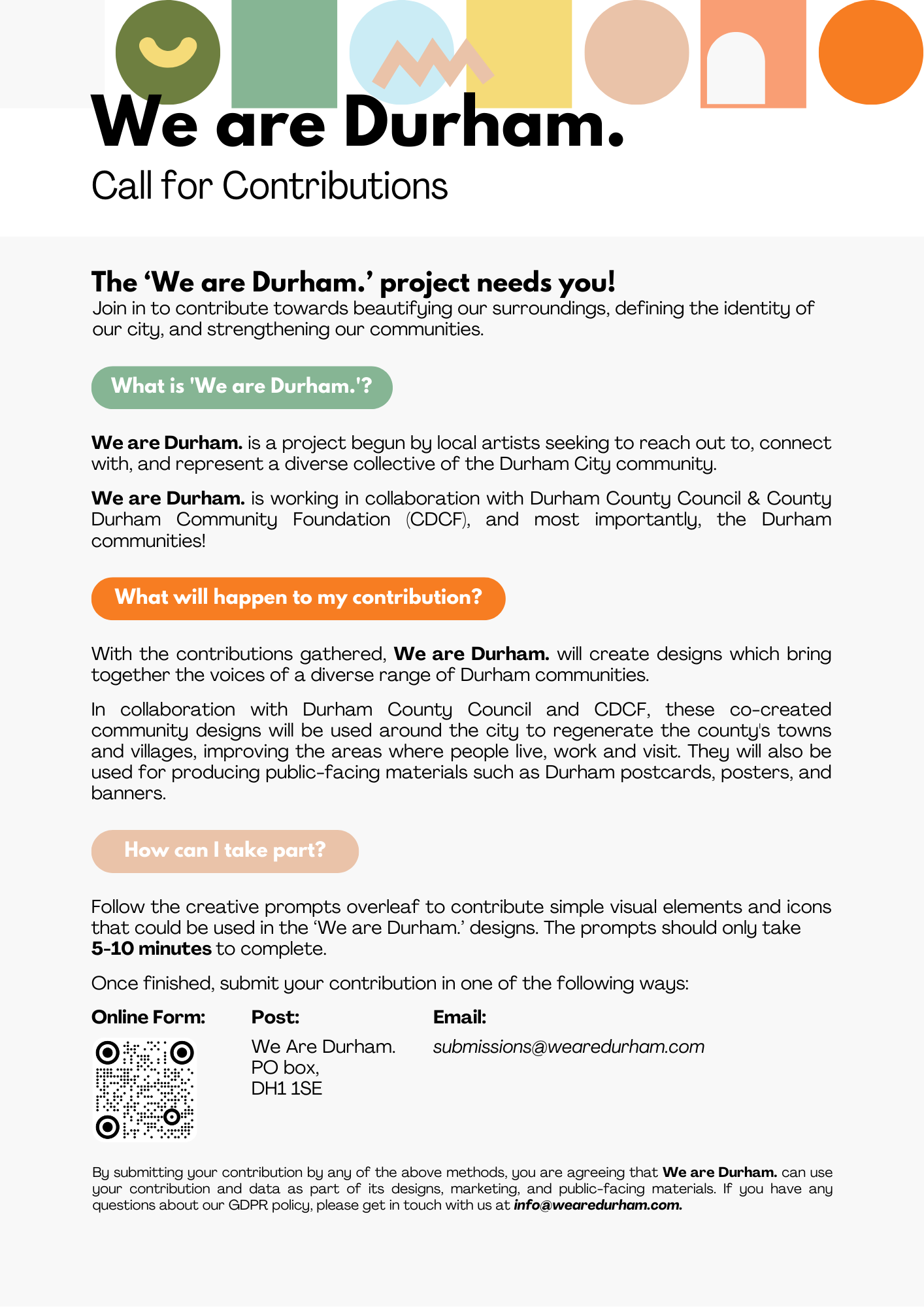
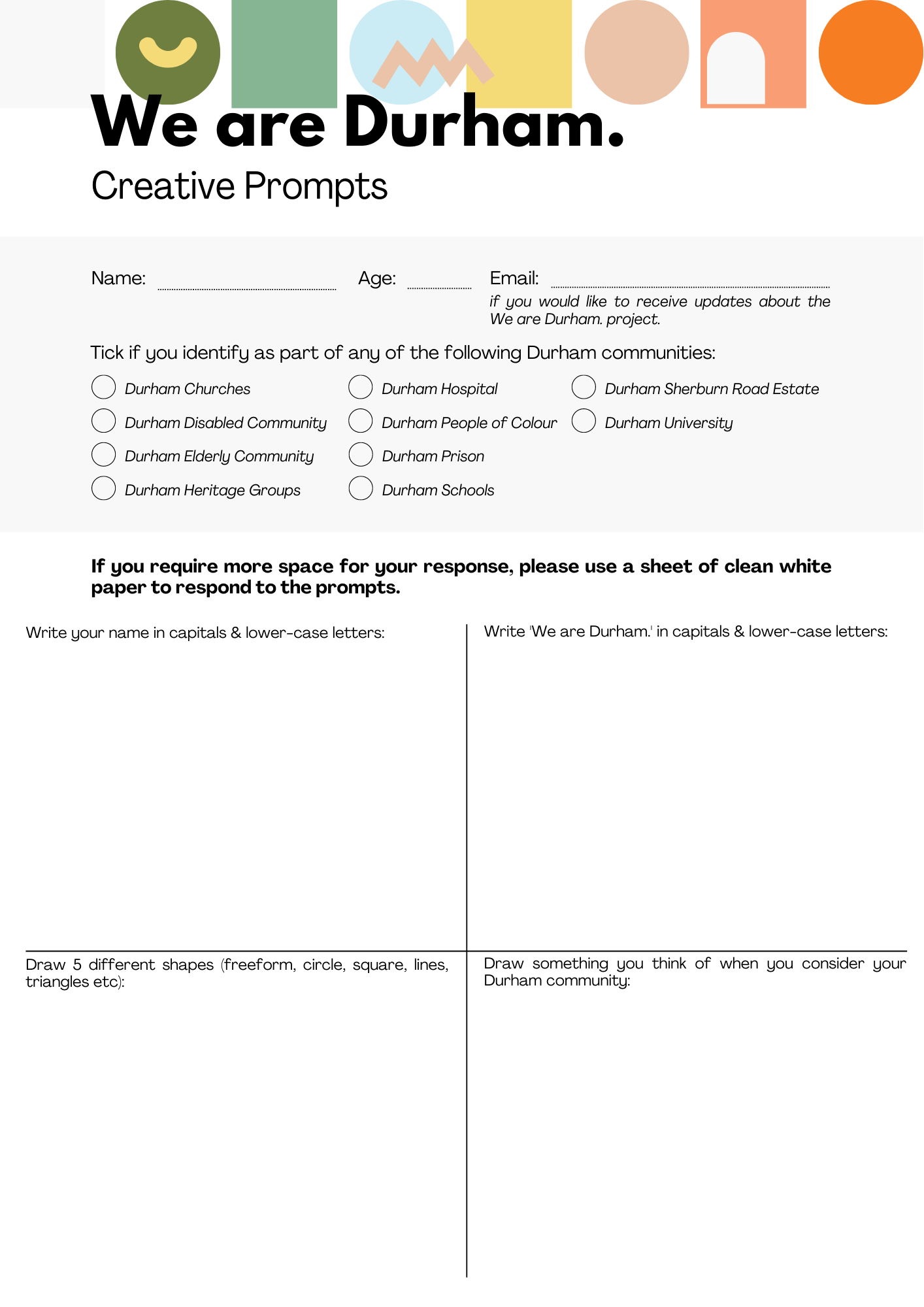
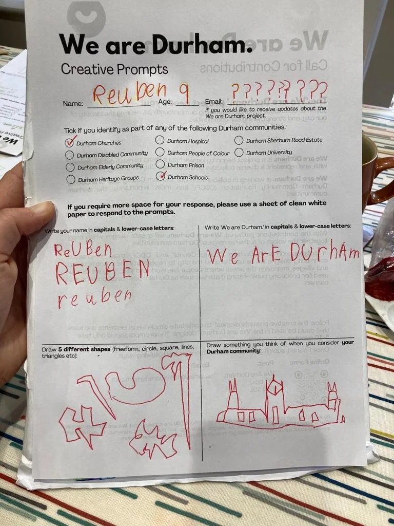
I built the project around participation. I created a simple set of printed creative prompts and invited people across different Durham communities (kids, adults, older residents) to contribute quick drawings, symbols, words and shapes that reflected their experience of Durham - the things they notice, value, and feel connected to.
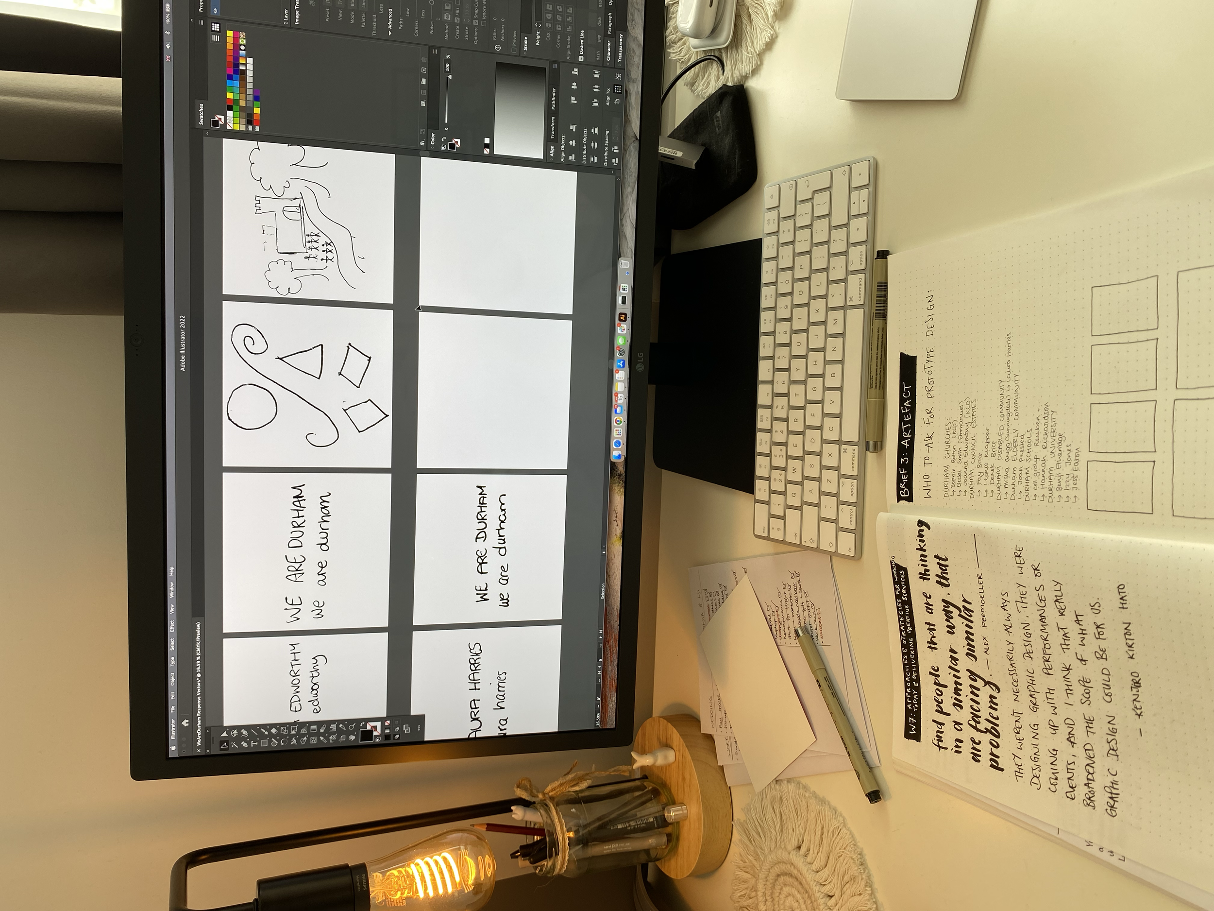
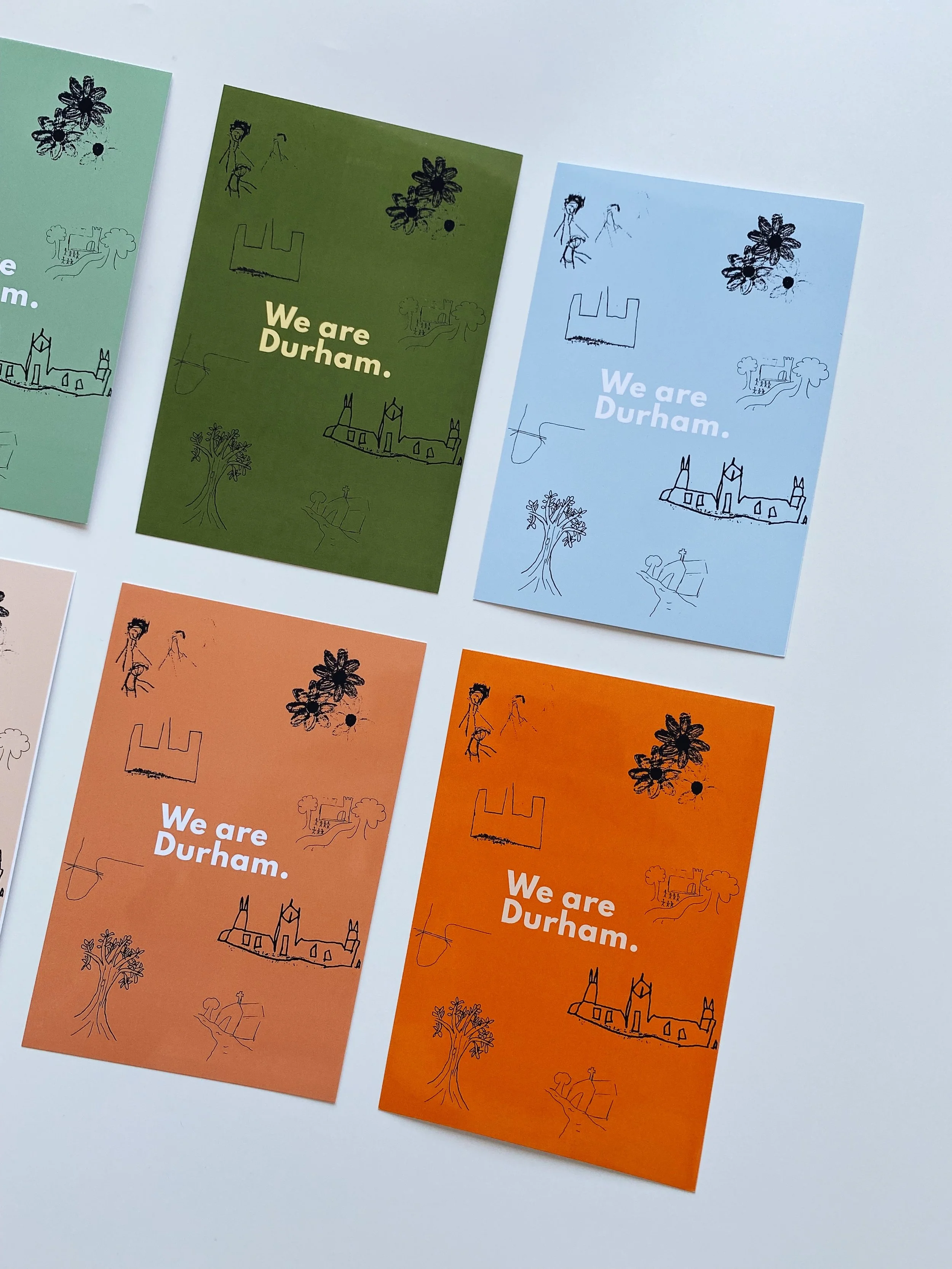
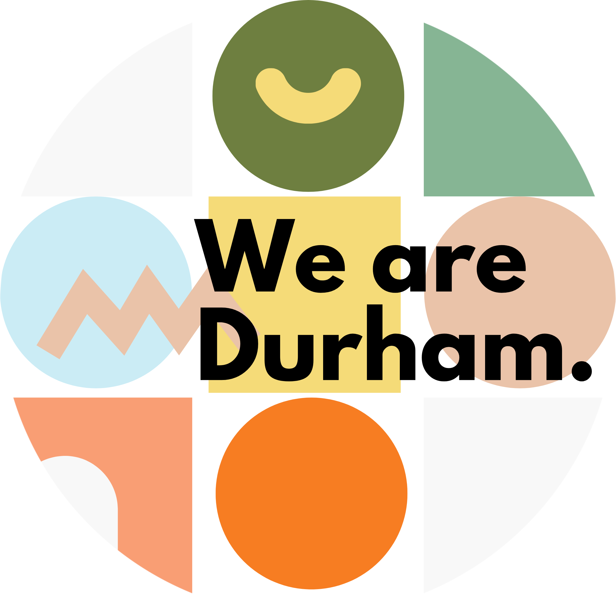
Instead of treating the contributions as “inspiration”, I treated them as the raw material of the identity system. I digitised and vectorised the drawings, then designed a flexible visual language that kept the personality of the original marks while still working as a cohesive set.
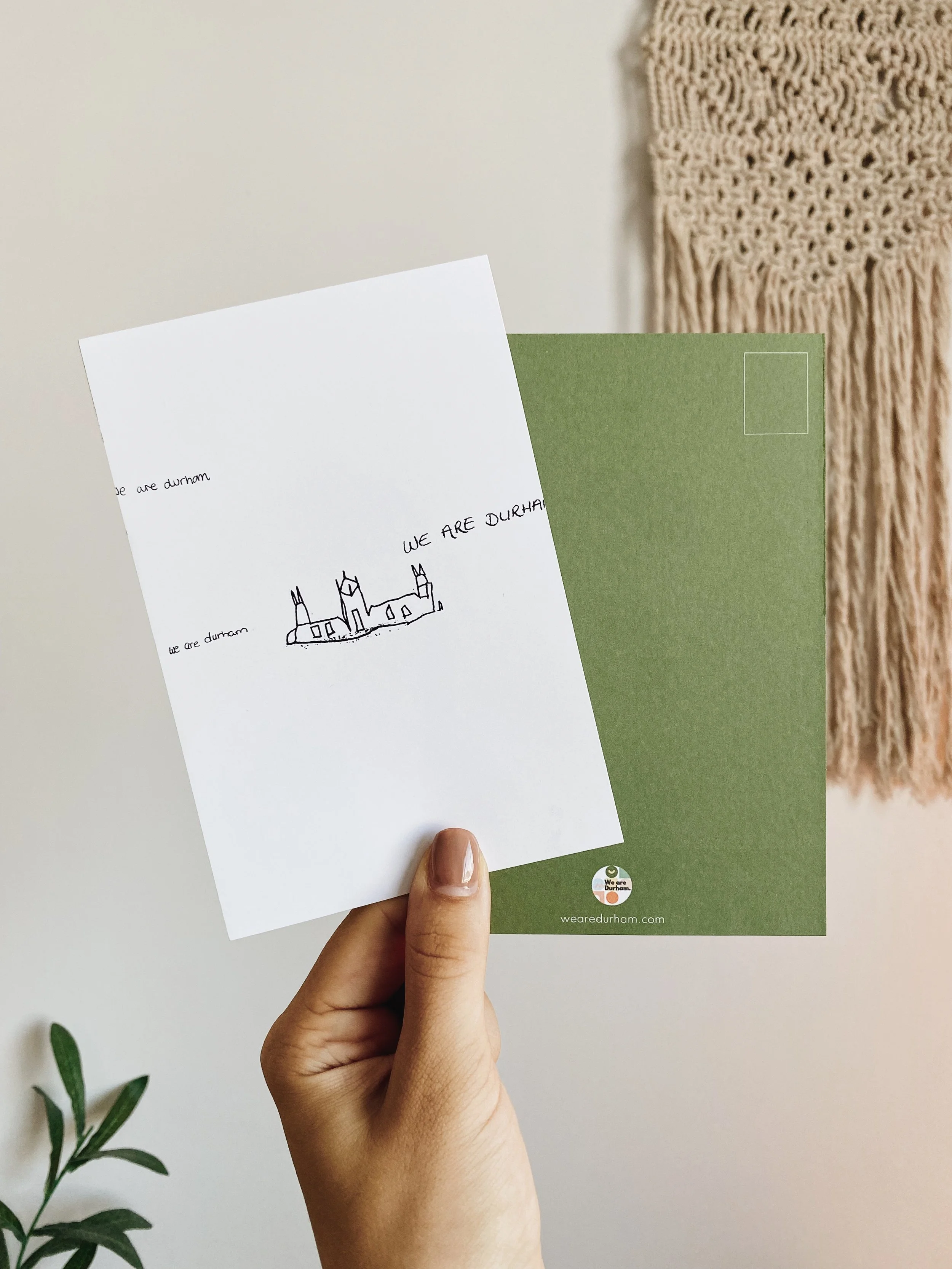
The final outcome was a series of A6 postcards, designed, printed and photographed as real artefacts - the kind of thing you could genuinely imagine in local shops, community spaces, or as part of a wider cultural campaign. The project sits at the intersection of community engagement and hands-on production, showing how design can be a process that creates connection as well as a finished outcome.
Community-led Design • Visual Identity • Co-creation • Illustration / Vectorising • Print Design • Socially-engaged Practice