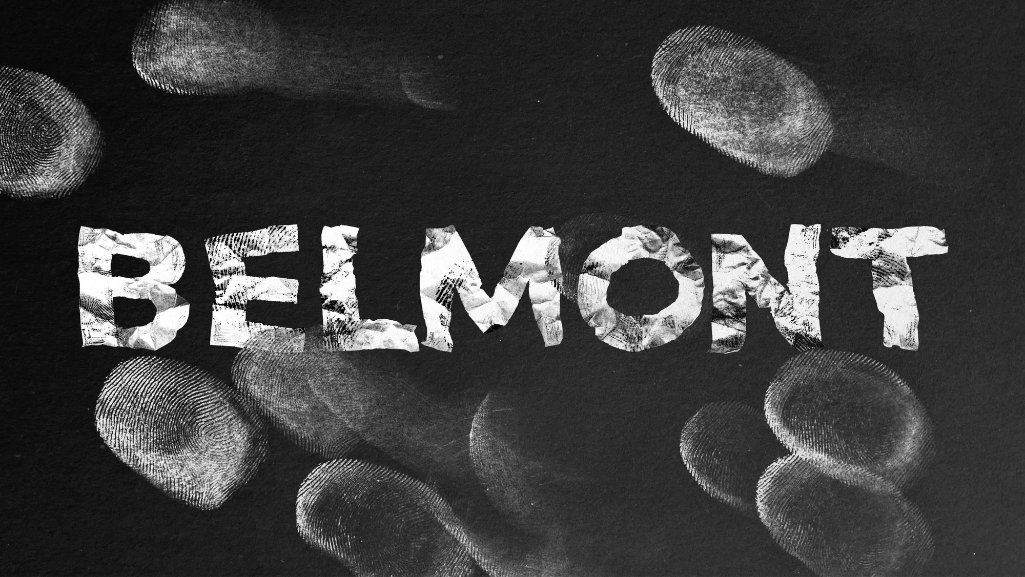
An experimental typographic wordmark shaped through physical distressing and tactile process.
Belmont began as a simple place-name - but the more I looked, the more it felt like a surface carrying history.
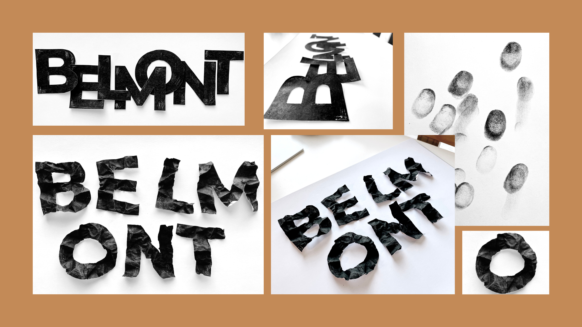
For this one-week MA project, I set out to create an illustrative typographic wordmark rooted in local identity. My research kept circling back to Belmont’s mining history, its memorials, and the way local materials and signage hold wear over time - fading paint, grit, erosion, weathering.
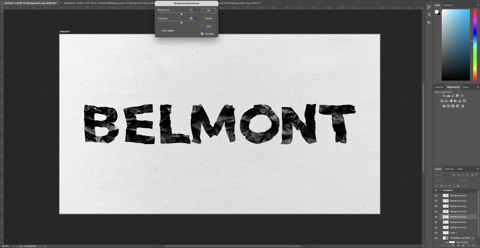
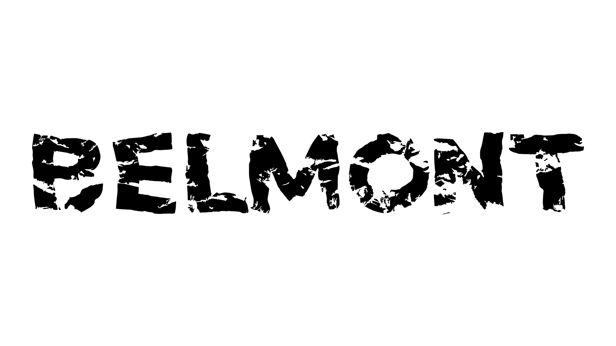
Instead of starting on-screen, I began with physical making. I printed the word in a bold typeface and started distressing it by hand - tearing, scrunching, re-forming - letting chance and texture shape the letterforms rather than forcing a clean outcome from the start. That messy, tactile stage became the heart of the project.
As I worked, fingerprints started appearing - first as accidental residue, then as something I leaned into. They felt like a direct metaphor for labour and human presence: marks left behind, repeated, layered, imperfect. That connection to mining history made the direction click.
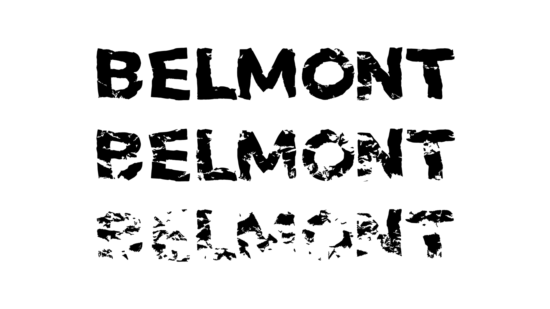
The final outcome is a typographic piece that balances structure with breakdown - letterforms that feel handled, weathered, and lived-in. More than a “logo”, it became a small study in how material process can carry meaning, and why I keep coming back to tactile methods when I want work to feel grounded.
Illustrative Typography • Experimental Type • Material-led Process • Place-based Research • Print-to-Digital • Texture & Distress